Kate Stone Palette
From $13.41 To $655.47
Regular Price $14.90 To $728.30
In stock
Save 10% on the basic palette of colors and mediums used by Kate Stone and required for her workshops.
Kate Stone Talks About Colors
“Dave and I are crackheads for Natural Pigments products. For many years we dabbled around with different brands—Winsor and Newton, Rembrandt-Talens, Old Holland, Mussini, Vasari, Blue Ridge, Daler-Rowney. They all work, and they each have certain colours that we love, but we like Rublev Colours best. We know George and Tania, we’ve seen their factory, and we know their paints are made the way we would make them ourselves if only we weren’t completely lazy and incapable. That is, they are made with a mind towards longevity. I want to say they’re archival, but George will just correct me because that’s the wrong word to use (can someone please come up with a word that we can use?).
“Rublev Colours Artist Oils have personality. Some feel very much like other brands in their handling, but others are wacky—ropy, gritty, grainy, stiff, tacky—-and that’s the fun part. I produced some good paintings before converting to Rublev Colours, but I don’t think I was a good painter until I made the switch. My paintings now have a tactile quality that they didn’t have before, because with Rublev Colours paints I find it easy and natural to build up impastos, or drag out a gritty scumble. Painting is never boring and I love how these paints sometimes make decisions for me.
“If you’re going to start with one paint, buy Rublev Colours Lead White #1 or #2. This is the single most important change you can make to your palette. Titanium whites are generally cut with zinc white, which we all know is bad. What you probably don’t know is that titanium white itself is almost just as bad. You will wind up with cracked paintings, especially if you work on flexible supports (stretched canvas). And besides, titanium white kills chroma and is brutally opaque. The only thing titanium white is good for is bone implants.”
Kate’s Palette (usually six to twelve of the following colors)
Ultramarine Blue (Green Shade)—Wonderful goopy texture.
Nicosia Green Earth—Pretty green, texture is rather dense, not a strong tinter.
Lemon Ocher/Blue Ridge Yellow Ocher—The latter has a more conventional texture.
Primrose Chrome Yellow
Orange Ocher/Italian Ocher Dark—A go-to for flesh.
Hematite
Madder Lake/Alizarin Crimson—I mix this with the above to get a spectrum of fleshy reds from cool to warm.
French Raw Sienna
French Burnt Sienna—Has some interesting grittiness. My go-to for painting red hair.
French Raw Umber—Rather like raw umber.
Cyprus Raw Umber Dark—Lovely and dark dark dark. Makes an inky heart of darkness when mixed with Ultramarine Blue.
Cyprus Burnt Umber Warm
Italian Raw Umber Green—Slightly greenish umber.
Lead White #2—Creamy and easy to blend. If you are used to Titanium White, this is an easy transition.
Flemish White—Stiff. Paint some crisp drapery with this.
Bone Black—I cut this colour with a bit of umber paint to help it dry hard. Super black.
Roman Black—A very light black. I've been using this to neutralize flesh tones.
Kate Shares Her Views on Oil Painting Mediums
“Oleogel: Read my article about Six Ways I Use Oleogel—a solventless painting gel.
“Impasto Medium or Velázquez Medium: These mediums are more like paints in that they contain a colourless pigment and a binder. When you add them to your paints, it doesn’t change the magical ratio of pigment to binder, and consequently you don’t incur the usual problems that you do when you add straight oil—weakening of the paint film, for instance. Impasto Medium squeezes out of a tube and sits on my palette with all my other paint blobs. Along with Oleogel, it’s now a staple for me. I use it for adding body to my paint when needed, of course, but there's another use for it too. Let’s say I’m having trouble hitting a high chroma, light value note with the colours on my palette. I can mix the right hue and chroma, but when I add the white to raise the value, the chroma gets lost. That’s where Impasto Medium saves the day. I often use my Impasto Medium instead of white to bump my lightest colours up a value without sacrificing chroma. If you’re working with a limited palette, this is an ass-saving feature.
“Velázquez Medium performs this same job, and it also imparts extra ropy-ness (great for detailing lace) and settles out for an almost melted appearances. I used it to paint the spiky peaks in a seashell. It settled out creating rounded ridges. Worked really well. Read how I used Velázquez Medium in the portrait Poppet.
“Epoxide Oil: Does beautiful sexy things to your paint. I mix a little bit directly into my paints on the palette. The result is lush, sensuous brush strokes that don’t sink in. I’ve only really used it for alla prima type stuff. Or, shall I say, paintings that I want people to think are alla prima.”
—Kate Stone
Basic Palette Colors
| Colors included in the Kate Stone Basic Palette | |||
| Color Swatch | Item Code | Series | Color Name |
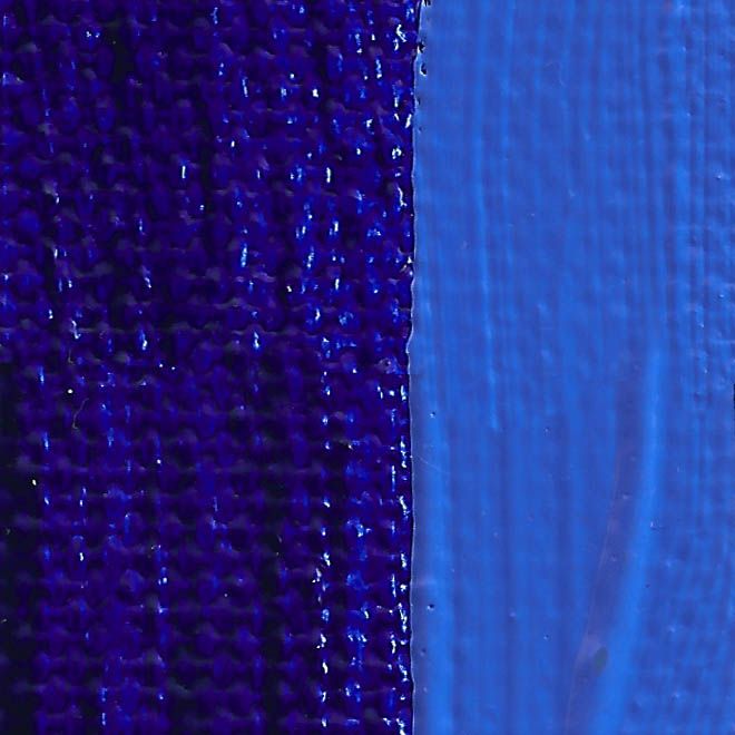 | 820-104 | 2 | Rublev Colours Ultramarine Blue (Green Shade) is an intense deep blue with greenish-undertones when mixed with white from inorganic pigment of sodium aluminum silicate composition. It is a transparent, fine grained color with high tinting strength. Kate Stone: Wonderful goopy texture. |
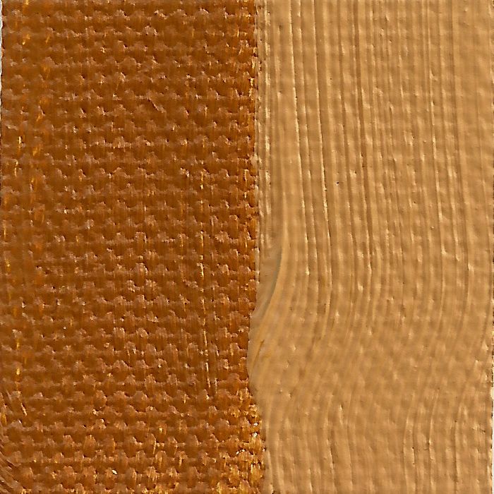 | 820-303 | 1 | Rublev Colours Blue Ridge Yellow Ocher is a semi-transparent golden yellow, very fine grained and has a buttery consistency. Our yellow ocher is a single pigment color made of natural earths from ocher deposits in the Blue Ridge mountains of Virginia. |
 | 820-321 | 4 | Rublev Colours Chrome Yellow Light is lead chromate, obtained synthetically as a yellow crystalline powder by precipitation from a solution of a lead salt. Chrome yellow light has good hiding power with bright yellow hue and high tinting strength. |
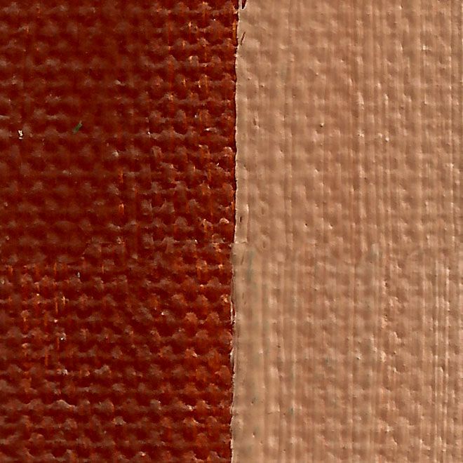 | 820-401 | 1 | Rublev Colours Orange Ocher is an opaque orange yellow with good tinting strength, fine grained and brushes "long" in the direction of the brush stroke. Kate Stone: A go-to for flesh. |
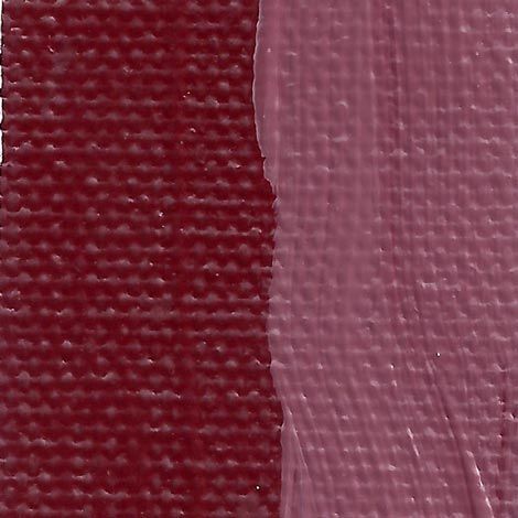 | 820-517 | 4 | Rublev Colours Hematite is bluish red with above average tinting strength. It is opaque, fine grained, goes on smoothly and brushes "long" in the direction of the brush stroke. |
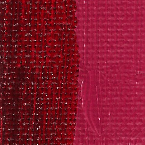 | 820-512 | 4 | Rublev Colours Alizarin Crimson is a translucent bluish red with high tinting strength, fine grained and a 'short' buttery paint. Kate Stone: I mix this with French Burnt Sienna to get a spectrum of fleshy reds from cool to warm. |
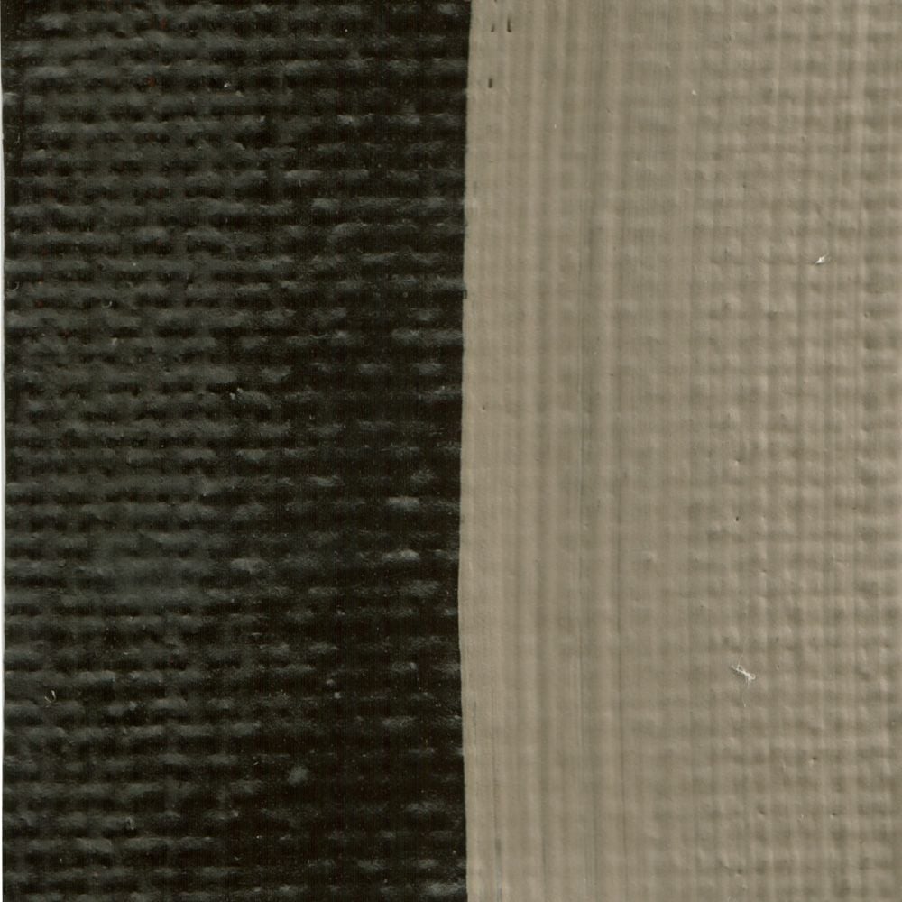 | 820-615 | 1 | Rublev Colours Cyprus Raw Umber Dark is a semi-transparent dark, almost black, brown with good tinting strength, medium grained and, like most Rublev Colours Artist Oils brushes long in the direction of the brush stroke. Kate Stone: Lovely and dark, dark, dark. Makes an inky heart of darkness when mixed with Ultramarine Blue. |
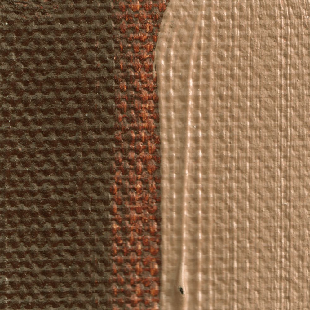 | 820-617 | 2 | Rublev Colours Cyprus Burnt Umber Warm is a semi-transparent reddish brown with good tinting strength, medium grained and, like most Rublev Colours Artist Oils brushes long in the direction of the brush stroke. |
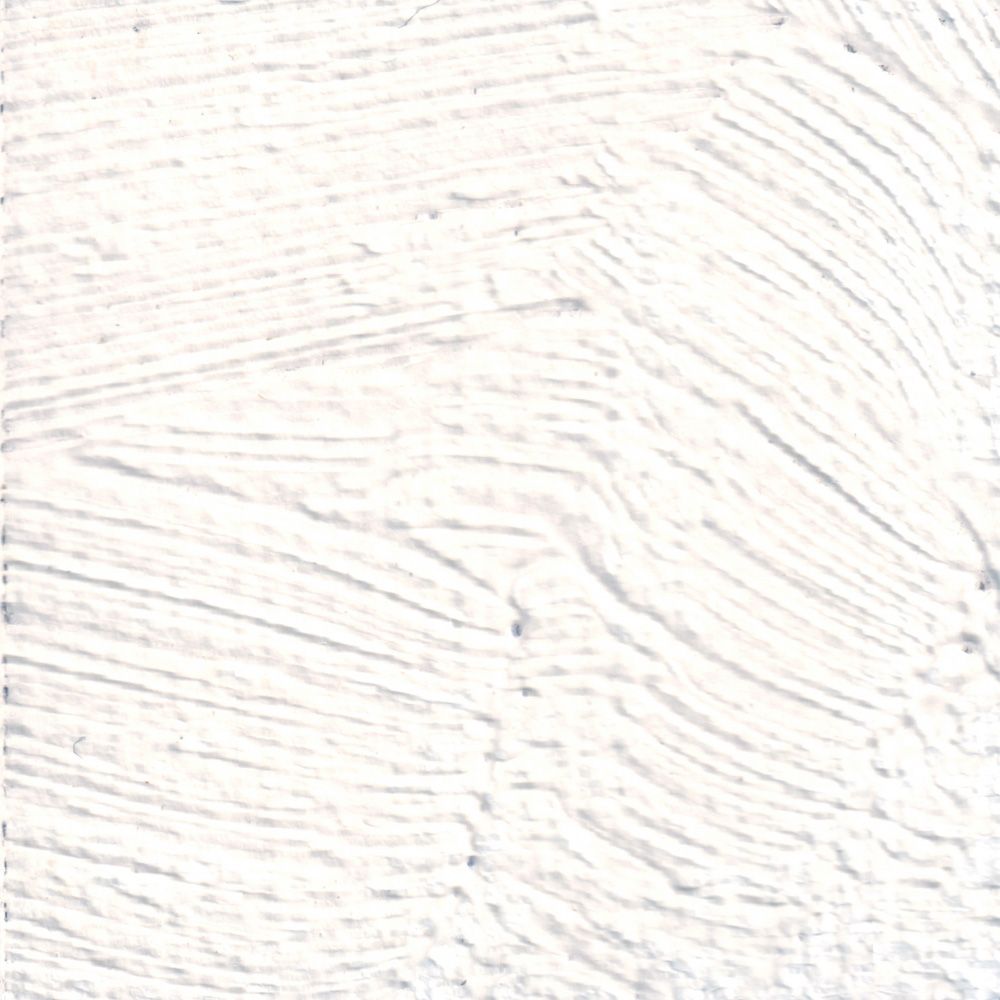 | 820-803 | 5 | Rublev Colours Lead White #2 in filtered, pale walnut oil is an opaque white that is soft and slightly ropy. Lead White #2 is a brighter white than our first flake white (also known as Cremnitz white) because of the paler walnut oil. Kate Stone: Creamy and easy to blend. If you are used to Titanium White, this is an easy transition. |
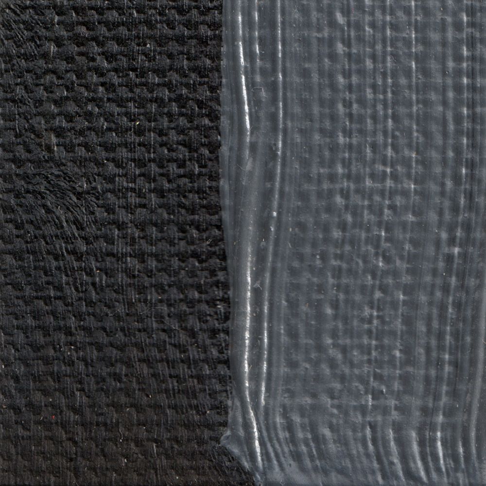 | 820-903 | 1 | Rublev Colours Bone Black is an semi-opaque black with good tinting strength, fine grained and brushes long in the direction of the brush stroke. Kate Stone: I cut this colour with a bit of umber paint to help it dry hard. Super black. |
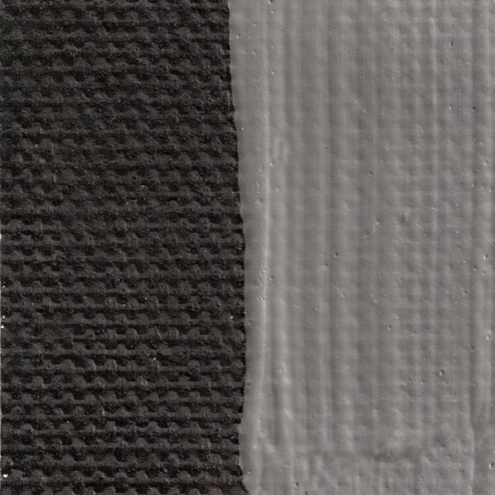 | 820-906 | 1 | Rublev Colours Roman Black iis a single-pigment color comprised of a natural black earth; a dense, opaque, heavy color that is permanent. It is comparatively neutral in undertone and is non-greasy, when compared to carbon blacks. Kate Stone: A very light black. I’ve been using this to neutralize flesh tones. |
Kate Stone Extended Palette
| Optional Colors in the Kate Stone Palette | |||
| Color Swatch | Item Code | Series | Color Name |
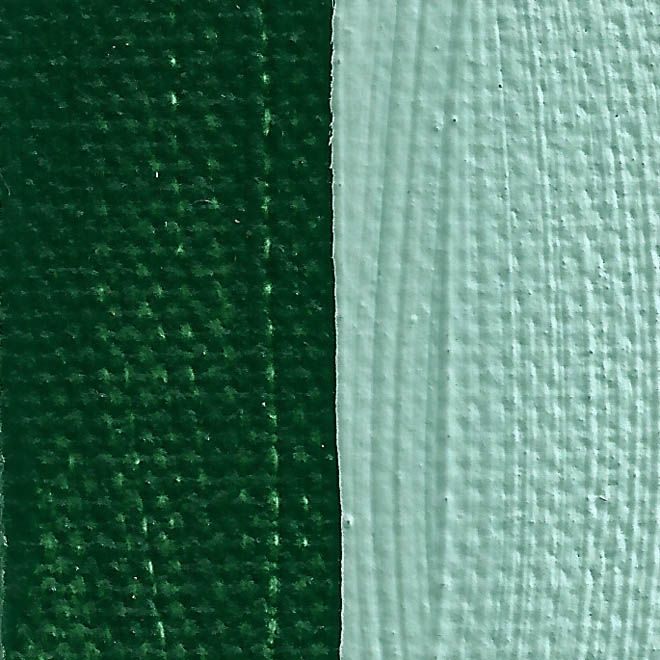 | 820-205 | 2 | Rublev Colours Nicosia Green Earth is a transparent deep green with yellow undertone, medium grained and low tinting strength. Our Nicosia green earth is from glauconite deposits in Cyprus. Kate Stone: Pretty green, texture is rather dense, not a strong tinter. |
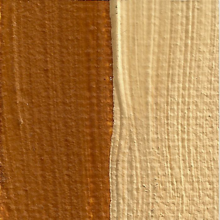 | 820-306 | 1 | Rublev Colours Lemon Ocher is a transparent yellow with low tinting strength, medium grained that makes lemon half tints. Our lemon (ICLES) ocher is from quarries in northern Italy. |
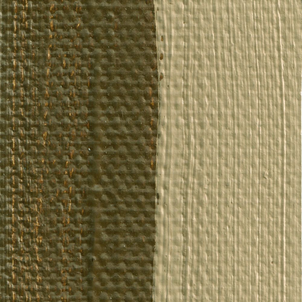 | 820-606 | 1 | Rublev Colours French Raw Sienna is a semi-transparent brown with good tinting strength, fine grained and brushes "long" in the direction of the brush stroke. |
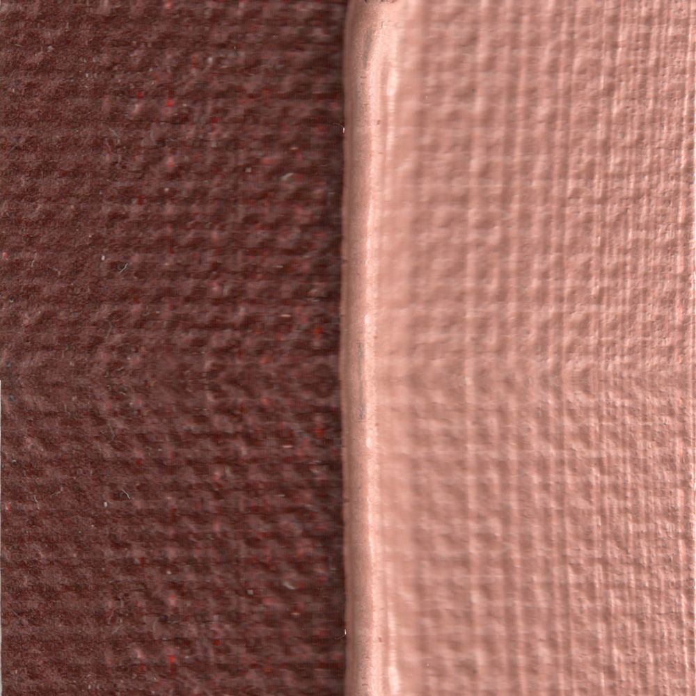 | 820-608 | 1 | Rublev Colours French Burnt Sienna is a semi-transparent reddish-brown, good tinting strength, fine grained and brushes "long" in the direction of the brush stroke. Our French sienna is from deposits in the Luberon Mountains. Kate Stone: Has some interesting grittiness. My go-to for painting red hair. |
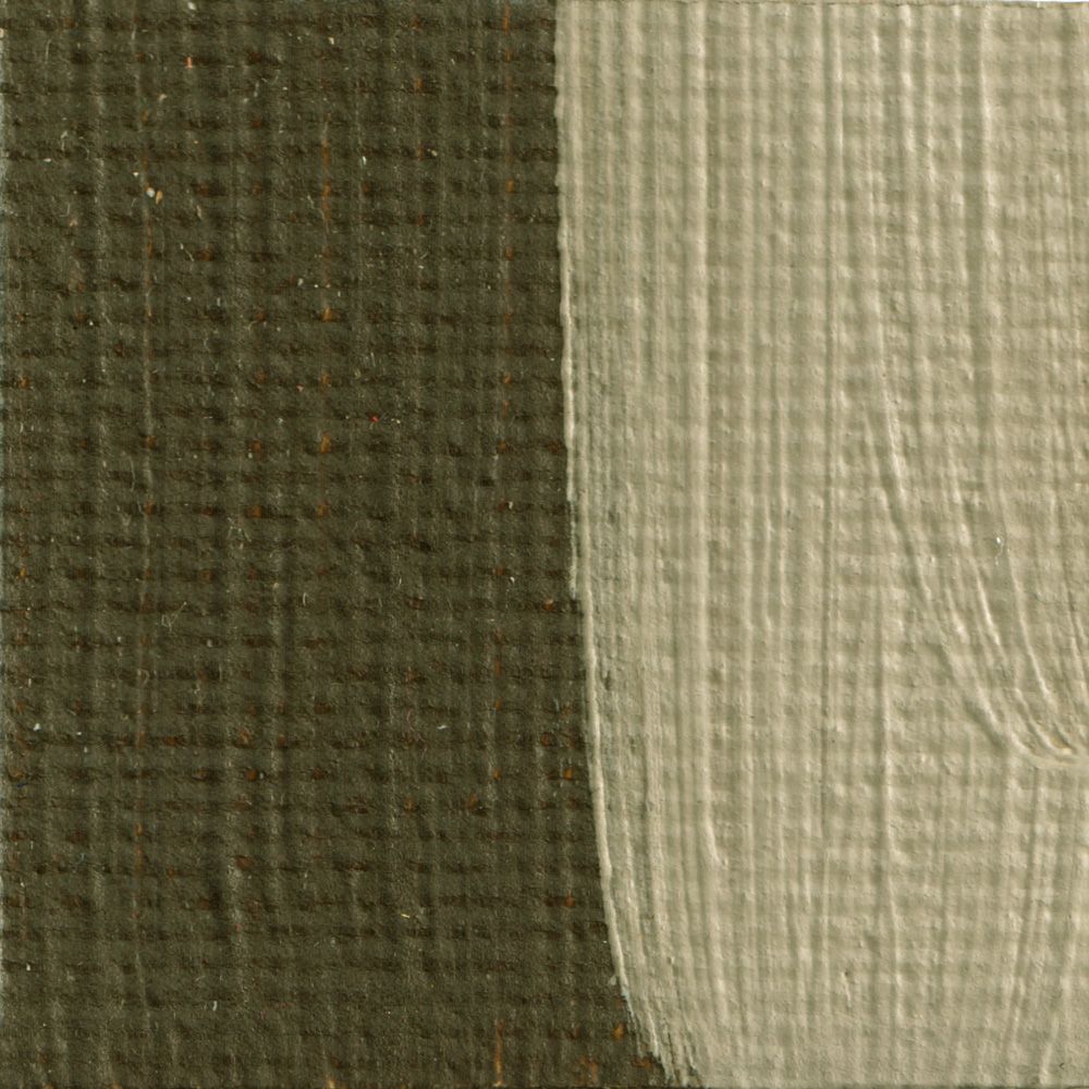 | 820-610 | 1 | Rublev Colours French Raw Umber is a semi-transparent, deep greenish brown with good tinting strength, fine grained and, like most Rublev Colours Artist Oils brushes long in the direction of the brush stroke. Kate Stone: Rather like umber. |
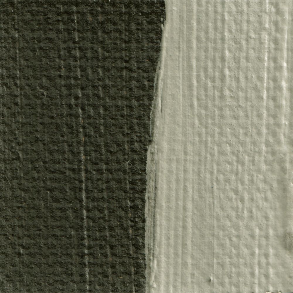 | 820-619 | 1 | Rublev Colours Italian Raw Umber Green is an opaque neutral with good tinting strength, medium grained and, like most Rublev Colours Artist Oils, brushes "long" in the direction of the brush stroke. Kate Stone: Slightly greenish umber. |
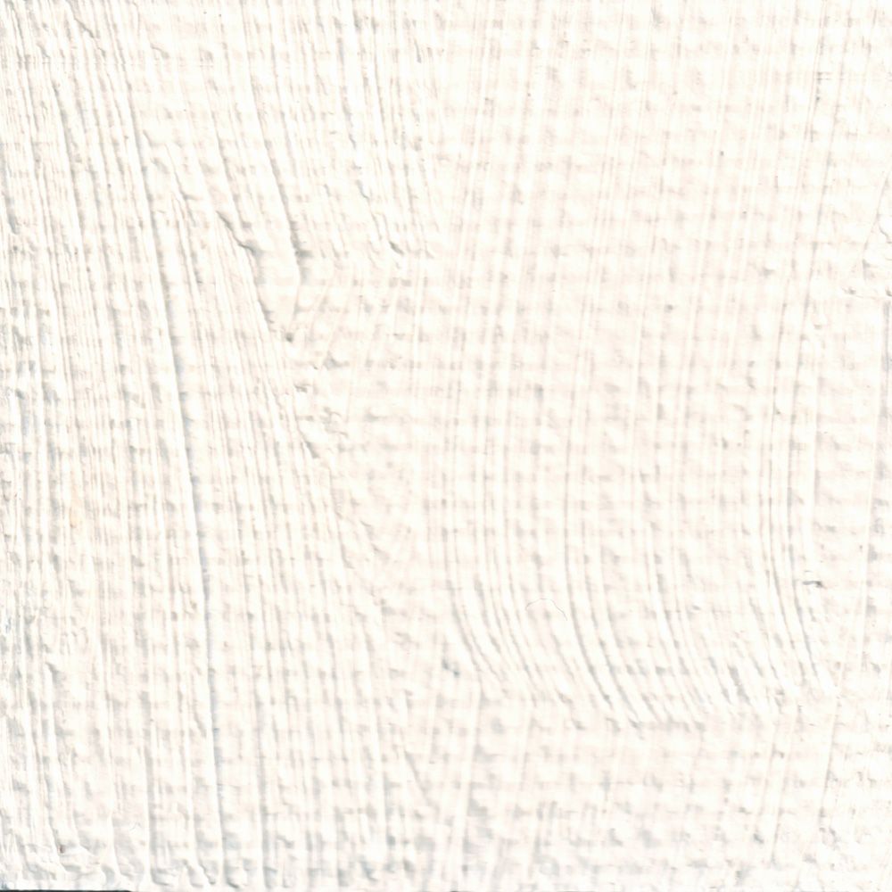 | 820-811 | 3 | Rublev Colours Flemish White is an opaque white pigment mixture based primarily on lead sulfate ground in linseed oil. This warm white is opaque, but not to the same degree as titanium white, so it won't kill colors in mixtures with it. It has a creamy, long consistency that makes it excellent in pure highlights. Kate Stone: Stiff. Paint some crisp drapery with this. |
Note: Colors swatches are shown in mass tone, straight from the tube, on the left, and mixed with an equal amount of white on the right. All pictures of color swatches in this web site are only approximations of the actual color of the oil paint. We taken every care to match the color in these pictures on calibrated color monitors to the actual color. However, because of the wide variance in color monitors the results you get may vary.
| SKU | 810-3011 |
|---|---|
| Brand | Rublev Colours |
| Vendor | Natural Pigments |
| Processing Time | Usually ships the next business day. |
Hazard Pictograms
 |  |  |
| GHS07: Exclamation Mark | GHS08-2: Health Hazard | GHS09: Environment |
Signal Word: Danger
Hazard Designation
H302 Harmful if swallowed.
H332 Harmful if inhaled.
H360 May damage fertility or the unborn child.
H373 May cause damage to organs through prolonged or repeated exposure.
H410 Very toxic to aquatic life with long lasting effects.
Safety Designation
P260 Do not breathe dust/fume/gas/mist/vapours/spray.
P261 Avoid breathing dust/ fume/ gas/ mist/ vapors/ spray.
P280 Wear protective gloves/ clothing/ eye/ face protection.
P281 Use personal protective equipment as required.
P405 Store locked up.
P501 Dispose of contents/ container according to regional, national and international regulations.
![]() WARNING: This product can expose you to chemicals including lead, which is known to the State of California to cause cancer and birth defects or other reproductive harm. For more information go to www.P65Warnings.ca.gov.
WARNING: This product can expose you to chemicals including lead, which is known to the State of California to cause cancer and birth defects or other reproductive harm. For more information go to www.P65Warnings.ca.gov.


