Hues or Mixed Colors of Historical Origin


Nova Reperta: Color Olivi (Invention of oil), engraving by Joannes Stradanus (1523–1605) around 1590 in Florence, publisher of the series Philips Galle and Jan Collaert. Stradanus depicts Jan van Eyck as the inventor of oil painting, a new painting technique in which pigments and vegetable oil are mixed, allowing a painter to create unique lighting effects. In the engraving of the artists’ studio, Jan van Eyck, seen at center, is painting a canvas of Saint George and the Dragon; next to him, an assistant prepares oil paint on a palette, and a young boy copies from a sculpture, at left, a man is painting from life a portrait of a lady; at right, two men are grinding colors by mixing pigment with oil.
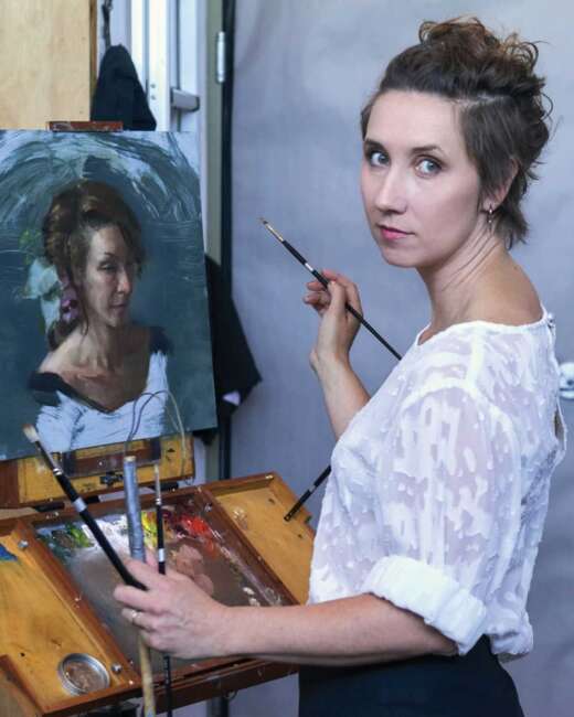
During the Middle Ages and the Renaissance, the paint used by artists was prepared in the studio. The painter purchased pigment from apothecaries and apprentices, who also prepared panels and grounds for the master painter, then prepared it for use as paint.
The oil paint used by artists from the fifteenth to nineteenth centuries consisted primarily of a single pigment and vegetable drying oil. However, gums, proteins, and resins were sometimes added for particular passages in a painting. The idea of a “hue” or mixed pigment practically did not exist because artists mixed colors on the palette.
By the late seventeenth century, an area of trade had come into being, the artists’ colormen, who supplied prepared pigments, made brushes, prepared canvases, and other items required by the artist. However, most professional painters continued to prepare their pigments, possibly through fear of adulteration of pigments. Expensive pigments like natural ultramarine (the pigment obtained from the semi-precious lapis lazuli stone) and vermilion were often adulterated with cheap additives by unscrupulous suppliers.

The Rawlinson color mill was used to prepare artists’ colors by the colorman James Rawlinson of Derby in the early 19th century.
In the nineteenth century, artists began purchasing paints from artists’ colormen rather than preparing their own as had been done centuries previously. This led to the development of “hues” or mixed colors, allowing artists’ colormen to increase the number of colors in their line of paint. The colormen mixed a few pigments to get new ones, suggesting real pigments. In some cases, they chose a different pigment or a combination of pigments to substitute for a color long familiar to artists because the original pigment was fugitive, performed inadequately, or too costly to use.
There are several problems with “hues” or mixed colors. One is the degradation of chroma when pigments are mixed, for pigments do not act in a mixture like spectrum hues in color or tone. The other problem is the name given to the mixture does not give the artist a clear understanding of the pigments used to make the hue, as these vary according to each manufacturer. A third potential problem with pigment mixtures is the interactivity of some pigments, which can lead to degradation.
We have provided a list of color names, most of which represent mixtures of pigments or “hues” that have been in use since the nineteenth century:
Blacks
Jet Black
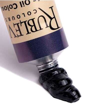
The name is derived from a geological material considered a minor gemstone. Although not a true mineral, it is a mineraloid of organic origin derived from decaying wood under extreme pressure. The English noun “jet” derives from the French word for the same material: jaiet (Oxford). Jet is either black or dark brown and may contain pyrite inclusions of brassy color and metallic luster (Pye, 279). The adjective “jet-black,” meaning as dark a black as possible, derives from this material and the name of the mixed color. Meyer describes this hue as a composition of 10 parts ivory black, one part umber, and one part Prussian blue (Meyer, 204). Today, however, some artists’ color manufacturers offer jet black as a single colorant of aniline black (PBk 1) or spinel black. Aniline black is one of the oldest synthetic organic pigments, discovered around 1860, making it a possible candidate to be sold under the name jet black since the nineteenth century.
Blue Black
Blue black appears in the catalogs of artists’ colormen circulated in the nineteenth century. Some references describe it as charcoal black, which may have been derived from charred vine cuttings or wood charcoal. Meyer describes this color as a mixture of 40 parts ivory black and three parts Prussian blue (Meyer, 204). Other compositions of blue black are listed as nine parts lampblack and one part Chinese or Prussian blue. Another formula gives the following composition 19 parts drop black and one part Prussian blue (Hiscox, 556).
| See Rublev Colours |
Neutral Tint
Josef Bersch describes a peculiar grayish violet mixture of Indian ink, Chinese blue, and a minimal quantity of madder lake that forms the color “neutral tint.” Altering the proportions of the pigments produces different shades of “neutral tint” (Bersch, 318).
Payne’s Grey
Named after the eighteenth and nineteenth-century watercolorist William Payne (Long, 3), the color was composed of indigo, crimson lake, and carbon black, according to one reference (Abney, 148). Later the constituents changed to various amounts of Prussian blue, carmine lake, and carbon black.
Yellows
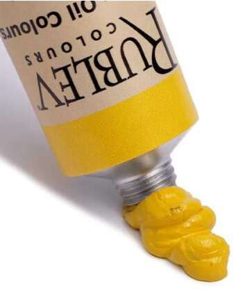
Golden Ocher or Gold Ocher
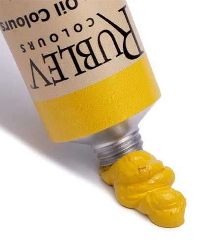
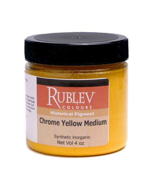
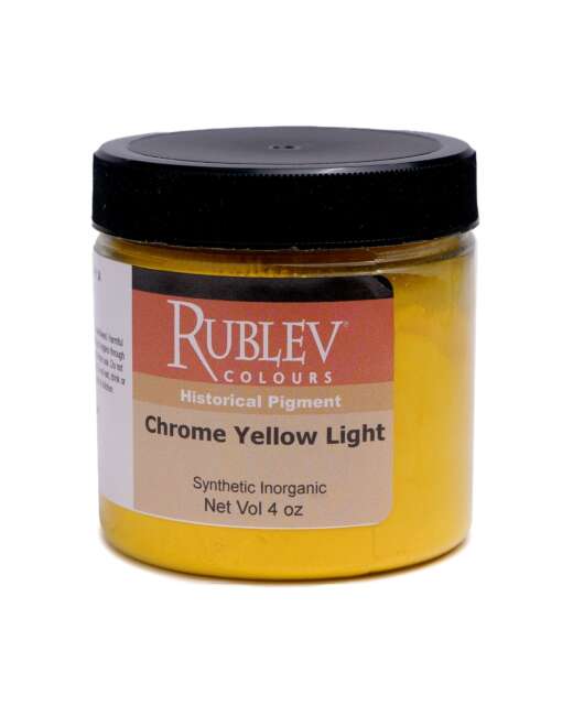
This name is given to colors comprising either a single pigment or mixed pigments. It is uncertain whether or not the artists’ colors of this name consisted of mixed pigments, as Uebele writes, “The artist when painting a picture will rarely, if ever, place on his palette a golden ocher that is made by mixing yellow ocher and chrome yellow, but the decorator is not so exacting.” (Uebele, 254) Of the mixed hues, an early twentieth-century formulary gives the proportions as 14 parts French yellow ocher, one part medium chrome yellow for the light shade, and nine parts Oxford ocher and one part orange chrome yellow for the dark shade (Hiscox, 557). Uebele provides several formulas, as there is ‘no standard in the trade’ for golden ocher or chrome ocher. For a pale or light shade of golden ocher hue, he recommends grinding 65 parts by weight of J.L.C.E.S. French ocher, the pale citron shade, seven parts by weight of chrome yellow medium, and 28 parts by weight of refined linseed oil for 100 parts of paste. For dark golden ocher, he suggests 65 parts J.F.L.E.S. French ocher (dark shade) with 7 pounds of light shade orange chrome yellow with 28 pounds of raw linseed oil (Uebele, 244).
Chrome Ocher
In his book, Paint Making and Color Grinding, Uebele describes this color as a mixture of yellow ocher and chrome yellow, similar to the light shade of gold ocher:
Chrome ocher, when expected strictly pure in oil, is only another name for golden ocher, and our formula for light shade will answer here, because it should be made only by adding neutral lead chromate, not the basic chromate of lead to ocher. When bought in quantity chrome ochers are not expected to be pure ocher and chrome yellow, but a sort of golden ocher with a marigold tint. (Uebele, 244)
He goes on to describe how to make the ‘marigold’* tint of chrome ocher ‘by mixing 17 parts J. L. C. E. S. ocher, 3 parts medium chrome yellow, 1 part Venetian red, 12 parts whiting, 50 parts floated barytes, and 17 parts raw linseed oil, for each 100 parts of medium soft paste.’ (Uebele, 244)
* Marigold is a yellow-orange color named after the flower of the same name.
| See Rublev Colours |
Roman Ocher
Roman ocher is listed in artists’ colormen catalogs of the mid-nineteenth century. It is described as a sort of ‘marigold tint’ that Uebele says is made of dark French ocher, J.F.L.E.S., 65 parts by weight and two parts by weight of bright Italian burnt sienna mixed with 32 parts of poppyseed or walnut oil (Uebele, 254). A later reference provides the formula: 23 parts French yellow ocher and one part each of burnt sienna and burnt umber (Hiscox, 557).
Oxford Ocher
The origin of this name is from the ocher found near Oxford. Church provides an analysis of a sample of yellow ocher from the pit on Shotover Hill near Oxford as the following percentages:
| Constituent | Percentage |
| Hygroscopic moisture | 7.1 |
| Combined water | 9.0 |
| Ferric oxide | 13.2 |
| Alumina | 6.3 |
| Silica | 61.5 |
| Calcium sulfate | 1.4 |
| Undetermined | 1.5 |
| Total | 100.0 |
The varying hues of different yellow ochers depend mainly upon two composition differences. One of these is the amount of clay (alumina silicate) or silica present, which lightens the color, and the other is the amount of ferric oxide, which gives them a warmer hue (Church, 123). It is uncertain when the deposit was exhausted, but the name was afterward applied to dark French ocher, J.F.L.E.S., or ocher deposits from England and Germany that were ‘free of grit and of rich, deep yellow color’ (Uebele, 254)
Greens
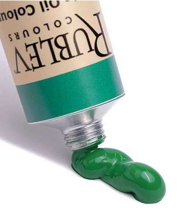
Chrome Green
Chrome Green is a term most commonly applied in the nineteenth century to a composite pigment where Prussian blue was precipitated on chrome yellow. Field adds that this term is used for ‘compounds of chromate of lead with Prussian blue and other blue colours.’ Chrome green was also designated the pigment green chromium oxide, distinguished from composite pigments of the same name by the terms Native green or True green.
| See Rublev Colours |
Cinnabar Green
Cinnabar Green or Green cinnabar is a name that designated a green copper tartrate or copper arsenic pigment of the eighteenth century. By the first half of the nineteenth century, the term denoted a composite pigment of chrome yellow and Prussian blue, providing a wide range of hues from dark to light tones.
| See Rublev Colours |
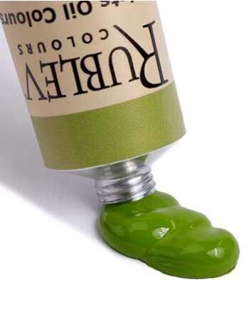
Olive Green
The name “olive green” or “mixed olive” is given to a wide range of mixed pigments, typically consisting of yellow ocher and cool black pigments. Seven parts light golden ocher and one part drop black is the recipe from Henley’s recipe book (Hiscox, 556). Another recipe consists of Indian yellow, umber, and indigo (Abney, 148). George Field instructs to compound mixed olive by combining green and purple, adding a smaller proportion of yellow and red to blue, or ‘breaking much blue with little orange.’ He further comments that the pigments selected for the mixtures were chosen to be conducive to the harmony of the picture (Field, 268).
Hooker’s Green
The earliest Hooker’s green was a mixture of gamboge and Prussian blue or indigo (Donlevy, 35 and Chambers, 407). More lightfast varieties were later created with aureolin or cobalt yellow. Modern Hooker’s green is usually a blend of phthalo blue, cadmium yellow, or Hanza yellow. There is a pigment, Nitroso Green (Pigment Green 8), that is sometimes called Hooker’s green, but this pigment does not offer any significant improvement over mixtures, as it is considered fugitive, given a lightfastness rating of III in oil paint by the American Society of Testing and Materials (ASTM).
Sap Green
This color was initially made from the unripe berries of the Buckthorn plant. In medieval times the extracted colorant was reduced to a heavy syrup and sold in pig bladders, not as a dry pigment. Modern oil paints under this name are actually mixtures of pigments that vary significantly with each manufacturer.
Reds
Indian Red
The name comes from the source of pigment, India, where natural red iron oxide is still extracted from the earth. The color consists of nearly pure hematite or red iron oxide (96–98%) containing a small amount of silica or alumina (Uebele, 212).
Light Red
The color designated “light red” is roasted (calcined) yellow ocher. The color is between Indian red and Venetian red.
Venetian Red
Initially, the name applied to red ocher pigments from the Veneto region of Italy. As colormen began supplying watercolors and oil colors to artists in the nineteenth century, pigment mixtures were offered as the color. According to Church, this color is less red than light red but not purplish like Indian red (Church, 180). It is primarily composed of hematite or red iron oxide. Uebele gives the following percentages for Venetian red:
| Venetian Red | |||
| Type/Origin | Red iron oxide | Terra alba | Silica or alumina |
| Persian Gulf | 35% | 50% | 15% |
| English | 28% | 72% | |
| Forest of Dean or Crawshay Red | |||
| Medium Shade | 40% | 60% | |
| Light Shade | 20% | 80% | |
Barite was often substituted for terra alba. Uebele instructs to grind approximately 77 parts by weight of the mixed pigments with 23 parts by weight of linseed oil (Uebele, 208).
Turkey Red
This name was often associated with an intense variety of Venetian red or red oxide (Hiscox, 557).
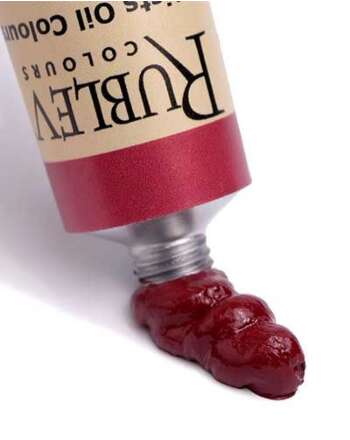
Tuscan Red
This color consists of equal parts by weight of hematite or red iron oxide and terra alba or calcined calcium sulfate in water and precipitated with madder. Uebele provides a recipe of 15 parts by weight of alizarin combined with 36 parts by weight each of red iron oxide and terra alba and mixed with 15 parts by weight of linseed oil (Uebele, 214). Another recipe for ‘ordinary’ Tuscan red consists of nine parts of Indian red, with one part, rose pink (a lake based on madder). ‘Brilliant’ Tuscan red is the combination of four parts Indian red and one part madder lake (Hiscox, 557).
| See Rublev Colours |
Scarlet Lake
This name appears in colormen’s catalogs throughout the nineteenth century. Uebele describes this color as a mixture of equal parts cochineal lake and vermilion combined with their weight of alumina sulfate. The paste paint is formed by grinding 72% of the weight of the pigment mixture with 28% weight of oil (Uebele, 231).
See the selection of |
References
Abney, 1908 Abney, William W. De. “The Action of Ozone on Water-colour Pigments.” Proceedings of the Royal Society of London, 1908.
Bersch, 1901 Bersch, Josef. The Manufacture of Mineral and Lake Pigments: Containing Directions for the Manufacture of All Artificial Artists’ and Painters’ Colours, Enamel Colours, Soot, and Metallic Pigments. Trans., Arthur Columbine Wright. Scott, Greenwood, 1901.
Chamber, 1892 Chambers’s Encyclopaedia: A Dictionary of Universal Knowledge, Vol. 5. W. & R. Chambers, Ltd., 1892.
Church, 1890 Church, Arthur Herbert. The Chemistry of Paints and Painting. Seeley & Co., 1890.
Donlevy, 1867 Donlevy, Alice. Practical Hints on the Art of Illumination. A.D.F. Randolph, 1867.
Field, 1841 Field, George. Chromatography; Or, A Treatise on Colours and Pigments: And of Their Powers in Painting. Tilt and Bogue, 1841.
Hiscox, 1910 Hiscox, Gardner Dexter. Henleys’ Twentieth Century Book of Recipes, Formulas and Processes. New York: N.W. Henley Publishing Co., 1910.
Long, 2008 Long, Basil S. William Payne, Water-Colour Painter Working 1776–1830. Read Books, 2008.
Meyer, 1912 Meyer Brothers Druggist. C.F.G. Meyer, 1912.
Oxford, 1989 Oxford English Dictionary (2nd edition). Oxford University Press, 1989.
Pye, 1985 Pye, K. “Electron microscope analysis of zoned dolomite rhombs in the Jet Rock Formation (Lower Toarcian) of the Whitby area, U.K.” Geological Magazine, Vol. 122. Cambridge University Press, 1985.
Uebele, 1913 Uebele, Charles L. Paint Making and Color Grinding. The Painters Magazine, 1913.


