Earth Colors and the Flesh Tone Palette

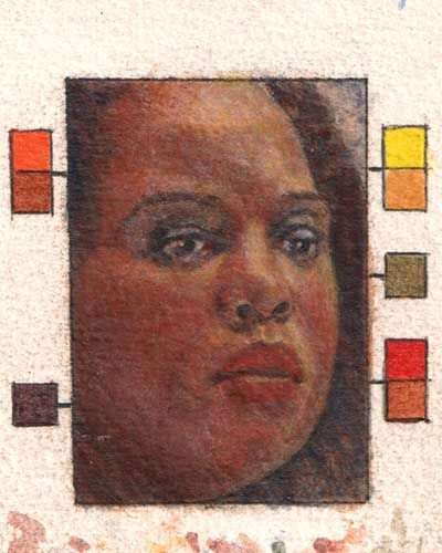
The first time I attended a convention of portrait artists, I was awe-struck by the array of beautiful works of art that stood before me. But as I admired each painting in turn, something became very evident. It was apparent that every portraitist was using essentially the same choice of colors on their palettes. This thread of mediocrity ran through what was otherwise a magnificent talent presentation. And my subsequent observations over the years have confirmed that portraiture is indeed in a chromatic rut.

Sabrina by Butch Krieger, 2005, oil on chalk ground and high-density fiberboard (HDF) panel, 14 x 18 inches.
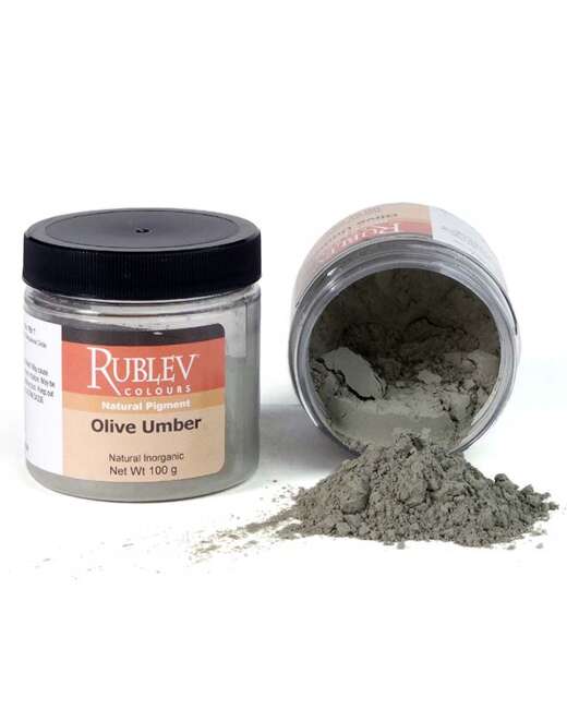
This is because the palette of the typical twenty-first-century oil painter has become overly standardized, with a somewhat formulaic assortment of pigments. And within that rigidly prescribed recipe, you will typically find only a meager selection of earth colors: a yellow ocher, a raw umber, a burnt umber, a raw sienna, a burnt sienna, and perhaps a terra verte.* These few earth colors become part of a tightly confined comfort zone for the artist, who then becomes reluctant to step outside that chromatic region and try something new.
You may note that I have used the indefinite article “a” before the name of each pigment in the preceding paragraph, such as “a raw umber” rather than just “raw umber.” I have done so because these names are not universally consistent. The colors of these pigments can vary considerably. As a case in point, raw umbers can vary so much that if they didn't have the same name—raw umber—you would never guess that they are supposedly the same color.
In my flesh tone workshops, I have discovered that most painters are unaware of the disparity in the umbers and other earth pigments. They were unaware that there were other options available to them. And this unawareness results in a missed opportunity, an opportunity to paint outside the box and possibly even to a palette that is unique to each of them. A peculiar collection of colors on one's palette is not an artistic evil. It can enable a painter to develop a chromatic style of their own.
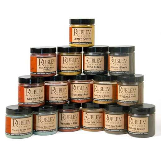
If you want to empower your palette, you may wish to consider the wide range of earth-pigment options available. In that case, you may need to dispel two widespread fallacies about earth colors. One of those erroneous beliefs is that the range of colors in earth pigments is too limited. You can dispel this fallacy easily. Just inspect the line of Rublev Colours Artists Oils that you will find at Natural Pigments.
Take a look at the numerous reds, yellows, blues, and greens—as well as the variety of rich browns you will find. You will also discover an orange ocher and a Violet Hematite. Most of these pigments are “historical.” They are, in other words, amid the naturally occurring colors that artists used before anyone learned how to manufacture artificial pigments. You may have heard that the range of colors, which were available to the past masters, was much more limited than what you can choose from now. As you can see for yourself, it was not nearly as limited as you may have thought.
The other common misconception about earth pigments is that they are drab or bland, if not outright dirty. You would not likely describe earth colors with such adjectives as bold, energetic, or intense—or at least now until you have seen such marvelous colors as the dynamically red Hematite or the radiant yellow of Orpiment. Many earth colors are “clean,” such as Cinnabar, Glauconite, Lapis Lazuli, and the Orpiment mentioned above.
Some earth pigments are somewhat subdued, such as Violet Hematite. But being subtle is not the same as being dirty. I used Violet Hematite, for example, to paint my model’s collar in the demonstration painting. And having done that, I also brought some of the violet into the underside of her chin and lower jaw, where it reflected light. When I glazed this color over the pre-existing flesh tones, it became very subtle but did not become bland. And its subtlety enabled it to integrate harmoniously with the base flesh tone already there.
I cannot deny that some earth colors are rather bland. For example, many paints labeled terra verte (French for green earth) are not pure earth colors. Some naturally occurring green earth are so dull that the paint manufacturers boost them by adding artificial pigments, such as chromium oxide green or Viridian. I haven’t told you this to discourage you from buying such mixed colors. Any one of them may well suit your needs. My point here is that all earth colors are not so bland. Some are, and some are not. It becomes a matter of mere discernment when shopping for colors.
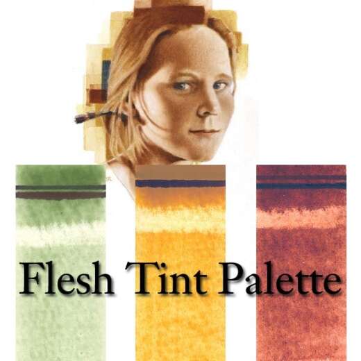
I have chosen to focus this article on flesh tones for two reasons. For one thing, the earth colors tend to lend themselves to making skin colors. Some of them even look just like the colors of flesh right out of the tube without your having to mix them. This is why I include them on my “Human Palette.”
The other reason I focused on flesh tones is their presumed difficulty level. If you can paint flesh tones with these colors, you can use them to paint anything you want. Nothing can be outside the scope of your chromatic prowess.
There is one other thing that I should point out to you if you want to learn how to paint portraits or figures. I suggest you use the same colors—whether or not they are earth colors—to paint the collateral forms, such as the clothing, that you use to paint the flesh tones. This simplifies the process considerably while helping you to achieve overall chromatic harmony in your composition.
Step-By-Step Portrait Painting
In this step-by-step presentation, I used an indirect technique, with which you can produce vibrant flesh tones by alternating layers of cool and warm colors. As you watch the sequence unfold, there are some things that you should keep in mind. For one thing, the stages of development that you will see here are those in which I introduced each color for the first time. You will notice, though, that I made other collateral adjustments as the painting progressed.
I have applied my paint in a variety of ways in this portrait. For the most part, I used broader applications of paint (such as washes) at the beginning of each step and progressed to more focused treatments such as spotting and drybrush technique. I mixed my paint with an alkyd medium, making it easier to spread the paint in thin layers and dry faster between applications. I made my washes by mixing the paint with the alkyd medium and then thinning it with turpentine.
In the lighter areas of the flesh tones, I usually mixed the colors with Lead White—a relatively transparent white pigment compared to Titanium White. I used the colors in the darker areas without mixing them with white. I aim to accumulate transparent and translucent layers of paint, each of which does not obliterate the colors and the white gesso beneath them.

Step 1
I began the portrait with a cool color, Verona Green Earth, with which I did the initial modeling. This was when I established all the primary tonal shapes (contrasting areas of lights and darks) that would define the image of this lovely young woman. Verona is a rich transparent green, with which you can paint very effective verdaccio (green underpaintings).

Step 2
Over the relatively cool Verona Green Earth, I layer a warm color—Indian Red. This red earth is a much more opaque pigment than the green earth. I scumble it in such thin layers that it does not obscure the underlayer.

Step 3
I next used another cool color—Lazurite (Lapis Lazuli). Lapis is a clear transparent blue that makes beautiful glazes. At first, I apply a thin layer of blue over the surface of the flesh tones. I put extra blue in the darker areas and mixed it with white for the lighter places. The blue does three things. It offsets and neutralizes the flesh tones, darkens the shadows, and provides the hue of the reflected light within the shadow side of the model’s face.

Step 4
I then went back to the hotter side of the spectrum with Cinnabar. As with the Lapis before it, I lightly glazed all the flesh-tone areas with the Cinnabar. I then added more of it to the redder parts of the flesh, especially the lips.

Step 5
I followed the Cinnabar with another cool color—Malachite. Malachite is a subtle green mineral color that is good for toning down warmer hues. At this point, I had completed the base flesh tones—and was ready to bring in the modifying colors and work some more on the hair.

Step 6
I had begun modifying colors earlier when I applied extra blue to the lighter places within the shadows. This represents a cool secondary source of light that comes into the picture from the right side. This was a “fill light” coming in from a nearby window. You will get the same effect if you have a nearby surface that bounces the primary light source into the shadows. On the left side of the image (Our left side, not the model’s), I used a touch of Orpiment to warm up the light side of the image. I applied it sparingly to avoid making the flesh tone look outright yellow. At this stage, I also resumed painting the hair by glazing Cassel Brown Earth over the underpainting.
Finishing the Portrait
I decided to finish the portrait by using Violet Hematite as the color of the model’s clothing. (She was wearing blue, but violet suited my purposes much better.) I then applied some of the same colors to the undersides of nearby forms—such as beneath the chin and jaw and the hair just above the collar. This represents the hue of her clothing bouncing up into these places. All that the portrait needed by this time were some final adjustments. I added some of the blue Lazurite into the planes of the hair that face the secondary light source. This brought it into sync with the reflected light in the model’s face and neck shadows. At this point, I decided I needed just a bit more of the Orpiment in the surface planes facing the left. I added some of the Orpiment to the loose tufts of hair that had fallen to the sides of the neck and a dab more to paint the color of the earring. After that, I placed three brush strokes beside and below the image to suggest the sources for the borrowed colors. (Just these swathes are enough to establish the chromatic environment for the portrait image and suggest a color atmosphere that surrounds it.) And with a touch more of the Verona Green Earth to the eyes, the portrait was complete.
Written and painted by Butch Krieger.
© 2005 Butch Krieger and Natural Pigments LLC.


