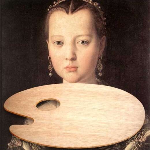
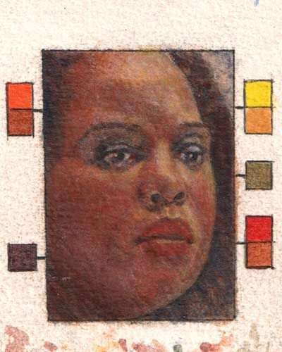
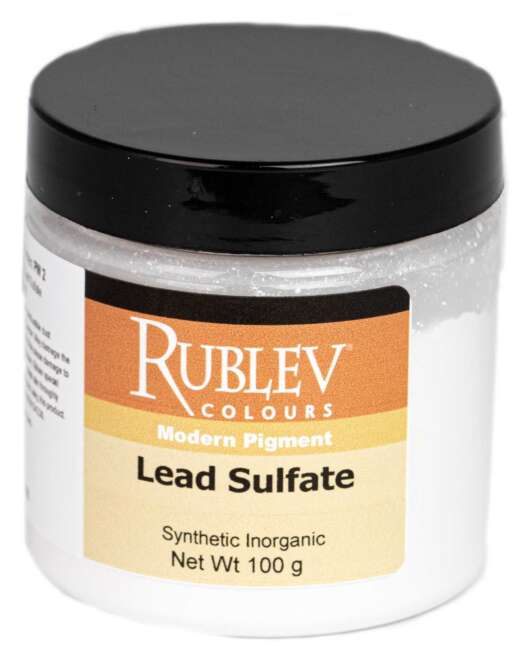
Rembrandt's palette is known for its muted earth tones, strategic use of light and shadow, and deep, rich colors contrasted with carefully placed highlights.
Rembrandt van Rijn's Color Palette: A Deep Dive into the Master's Techniques

Rembrandt Harmenszoon van Rijn (15 July 1606 – 4 October 1669) was a Dutch painter and etcher. He is considered one of the greatest painters and printmakers in European art history and the most important in Dutch history.
Rembrandt's palette was not just a mere choice of colors; it was a deliberate, emotional, and intellectual selection aimed at bringing his subjects to life. Unlike his contemporaries, Rembrandt favored a muted palette, focusing on deep browns, rich ochres, and glowing umbers, contrasted with strategic highlights. This approach allowed him to create an astonishing range of tones and moods, all contributing to the dramatic intensity of his works.
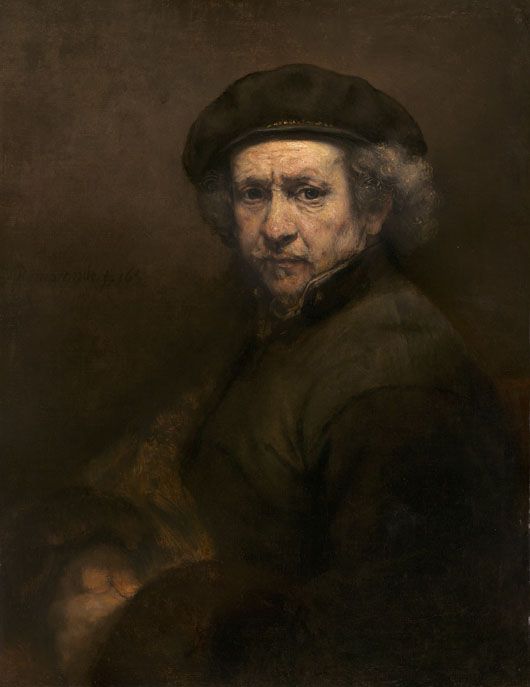
Self-Portrait, Rembrandt van Rijn, 1659, oil on canvas, 84.5 cm x 66 cm (33 1/4 in x 26 in), National Gallery of Art, Washington, DC, 1937.1.72
Historical Context and Influence
The 17th century, an era marked by scientific discoveries and a burgeoning art market, significantly influenced Rembrandt's color choices. His palette evolved over his lifetime, reflecting not only the artistic trends and material availability of his time but also his personal experiences and the maturation of his artistic vision.
The range of colors Rembrandt employed falls firmly within the mainstream of painting practice in Holland in the 17th century. His palette is entirely made up of widely available pigments and, by that time, well understood in their qualities and drawbacks. Seventeenth-century Holland was a center for manufacturing artists' pigments on an industrial scale. The technologies required have evolved enough to remove the uncertainties in preparing standard products. Large-scale processes for producing lead white, vermilion, smalt, and lead-tin yellow, all of which are found frequently in Rembrandt's paintings, had reached an advanced degree of refinement, and these pigments were available in both domestic and foreign markets. Imported pigments from Italy and elsewhere made up for local deficiencies in naturally occurring mineral and earth pigments and some of the raw materials for preparing specific manufactured colors.
Analyzing the Composition of Rembrandt's Pigments
To truly appreciate the Rembrandt color palette, one must delve into the specifics of its composition and how it was masterfully applied to canvas and panels. Researchers have found Rembrandt used the following pigments at different times in his work:
- Azurite
- Smalt
- Lead-tin yellow
- Orpiment and artificial orpiment
- Yellow ocher
- Red ocher
- Vermilion
- Madder lake
- Carmine lake
- Raw Sienna
- Burnt Sienna
- Raw umber
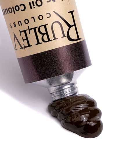
- Burnt umber
- Cassel earth
- Brown ocher
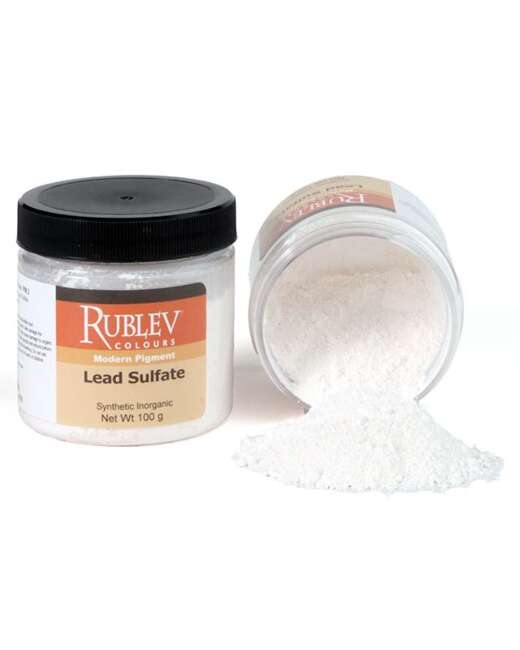
- Lead white
- Bone or ivory black
The Core Colors of Rembrandt's Palette
Rembrandt's primary colors included earth tones like burnt sienna, raw umber, and yellow ochre. He complemented these with bold accents of vermilion, lead-tin yellow, smalt and azurite, creating a harmonious yet dynamic color scheme. Each color served a purpose, either to model forms, define space, or evoke emotions.
Techniques and Application
Rembrandt's genius was not just in his color choice but also in how he applied them. His technique was a study in patience and precision, often building up color through layers of paint, each adding depth and richness to the image.
Layering and Glazing
Through layering and glazing, Rembrandt achieved an unparalleled depth in his paintings. The layers of transparent glazes allowed the colors to interact in a subtle and complex manner, creating a luminous effect that seemed to bring the paintings to life.
The Role of Light and Shadow
Rembrandt's understanding of light and shadow was revolutionary. He used his color palette to sculpt light, allowing it to cascade softly across a subject or to punctuate a scene dramatically. The interplay of light and dark, known as chiaroscuro, is a signature aspect of his work, showcasing his mastery of using color to shape space and mood.

Isaac and Rebecca, known as ‘The Jewish Bride’, Rembrandt van Rijn, c. 1665–c. 1669, oil on canvas, 121.5 cm × 166.5 cm (47.8 in × 65.5 in), Rijksmuseum
The Psychological Impact
Rembrandt's colors do more than please the eye; they speak to the soul. Each hue, each stroke of the brush, carries an emotional weight, connecting with viewers on a deeply psychological level.
Emotional Resonance
The muted earth tones and strategic use of light in Rembrandt's paintings evoke a sense of intimacy and introspection. His use of color is not merely for representation but to stir emotions, to reflect the inner turmoil or tranquility of his subjects.
Symbolism and Meaning
In Rembrandt's work, colors are not arbitrary; they are laden with symbolism and meaning. From the divine radiance of golden hues to the somber depth of dark browns, each color choice is a deliberate expression of narrative and thematic elements.
Rembrandt's color palette is not just a component of his art; it's a testament to his legacy as a master storyteller and visionary artist. His profound understanding of color's power to evoke emotion, define space, and convey meaning continues to inspire and influence art and design. As we delve into the depth of his palette, we find more than just color; we find a reflection of life itself, complex, nuanced, and profoundly moving.
Historical and Modern Substitute Colors
Rembrandt's paintings are dominated by a limited selection of lead white, bone black, and natural earth pigments, such as ochers, siennas, and umbers; other pigments are regularly used, but these are his staples. His palette consisted of the following pigments:
Pigment | Oil Paint Equivalent | Pigment Equivalent |
Azurite | Not available | |
Smalt | Not available | |
Lead-tin yellow |
| |
Orpiment and artificial orpiment | (orpiment) |
|
Yellow ocher |
| |
Red ocher |
| |
Vermilion |
| |
Madder lake |
| |
Carmine lake | Not available |
|
Raw Sienna |
| |
Burnt Sienna |
| |
Raw umber |
| |
Burnt umber |
| |
Cassel earth |
| |
Brown ocher |
| |
Lead white |
| |
Bone black |
|
In the table, we have listed the pigment used by Rembrandt on his palette and the equivalent available today from Natural Pigments.
References
David Bomford, Art in the Making: Rembrandt, Yale University Press, p. 35–46.
Waldemar Januszczak, Techniques of the World’s Great Painters, Chartwell, 1980.
Ernst Van De Wetering, Rembrandt: The Painter At Work, Amsterdam University Press, 1997, p. 149–152.
van Loon, A., Noble, P., Krekeler, A. et al. Artificial orpiment, a new pigment in Rembrandt’s palette. Heritage Science 5, 26 (2017). https://doi.org/10.1186/s40494-017-0138-1
Frequently Asked Questions
What are the key characteristics of Rembrandt's color palette?
How did Rembrandt achieve depth and texture in his paintings?
Rembrandt achieved depth and texture through meticulous layering and glazing techniques, allowing colors to interact in complex ways and creating a luminous effect.
How does Rembrandt's use of color impact the viewer psychologically?
Rembrandt's color choices evoke emotions and introspection, with each hue and stroke of the brush carrying an emotional weight that connects deeply with the viewer.
In what ways is Rembrandt's color palette relevant in modern art and design?
Rembrandt's palette influences modern art and design by inspiring artists and designers to use color to convey depth, emotion, and narrative, as well as to create ambiance and invoke emotional responses.
What can contemporary artists and designers learn from Rembrandt's approach to color?
Contemporary artists and designers can learn the importance of using color deliberately to evoke emotion, define space, and convey meaning, as well as the value of understanding the psychological impact of color choices.
Why did Rembrandt use dark colors?
Rembrandt used dark colors to create depth and focus on lighting and shadow, emphasizing the emotional and narrative aspects of his subjects. This technique, known as chiaroscuro, is a hallmark of his style, allowing him to direct viewers' attention and evoke a strong atmospheric or dramatic effect.
Did Rembrandt use a palette knife?
There is no direct evidence to suggest Rembrandt used a palette knife. His works are known for their intricate brushwork and texture, often achieved through traditional brushes. However, artists of his time were innovative and may have used various tools for different effects.
What was Rembrandt's favorite color?
While there is no definitive record of Rembrandt's favorite color, his paintings often feature rich, earthy tones like deep browns, umbers, and siennas, complemented by luminous highlights in yellow and white, suggesting a preference for warm, naturalistic colors.
Did Rembrandt use glazes?
Yes, Rembrandt was known to use glazes. He skillfully applied thin, transparent layers of paint over dry underpainting, a technique that allowed him to achieve rich, luminous colors and a remarkable depth in his work, adding to the three-dimensional effect of his paintings.
How many colors did Rembrandt use?
Rembrandt was not limited to a specific number of colors but rather had a palette consisting of a variety of natural earth tones, lead whites, and occasional bright colors. He was known for mixing and layering these colors to create a wide spectrum of hues and tones in his artwork.


